Shop WIBO Staff Dashboard
Overview
About Client
Workshop in Business Opportunities "WIBO" is a non-for-profit organization that has been around for more than 50+ years. Their 16 week bussiness workshops has taught more than 18,000 business owners on how to build and grow a sustainable business. WIBO has plans to build an e-commerce platform called "Shop WIBO", which will help new and seasoned business owners of the program to sell/promote their product/services on the platform.My Role
As a UX Consultant, working on a team, I was responsible for researching, strategizing, ideating, defining, and designing final deliverables.
Duration: 2 months (March-May 2019)
Team Members: Jamal Combs, Jalena Hay
OBJECTIVE
To create a staff dashboard that should be able to do the following:- 1. Analyzing global sales results
- 2. Resolving issues and communicating with business owners and customers, and managing product/services pages
- 3. Monitor business product/services pages
Research
User Interviews
The first step on creating the staff dashboard is we conducted 4 user interviews of current WIBO staff members. We wanted to get an understanding of:
- 1. Who they are and what their responsibilites are
- 2. What relationship do they have with the graduates
- 3. What they would like to see on the dashboard
- 4. What issues and struggles they are currently facing within their daily tasks
Key Points
-
After conducting the interviews, I synthesized the data and this is what I came up with:
- 1. 90% of the staff are WIBO graduates and have their own business
- 2. WIBO’s reputation is their main concern - they need to make sure that the business owners keep their promises when participating on the platform.
- 3. They would like to implement an application process - have specific requirements who can participate.
- 4. Dashboard should be easy to use with very minimal hidden features
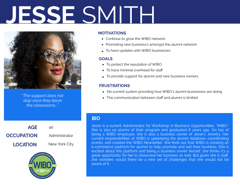
User Persona
Click to view
After synthesizing the data from the interviews, I developed a persona to respresent their motivations, goals, and frustrations
Structuring the dashboard, our process…
Card Sorting
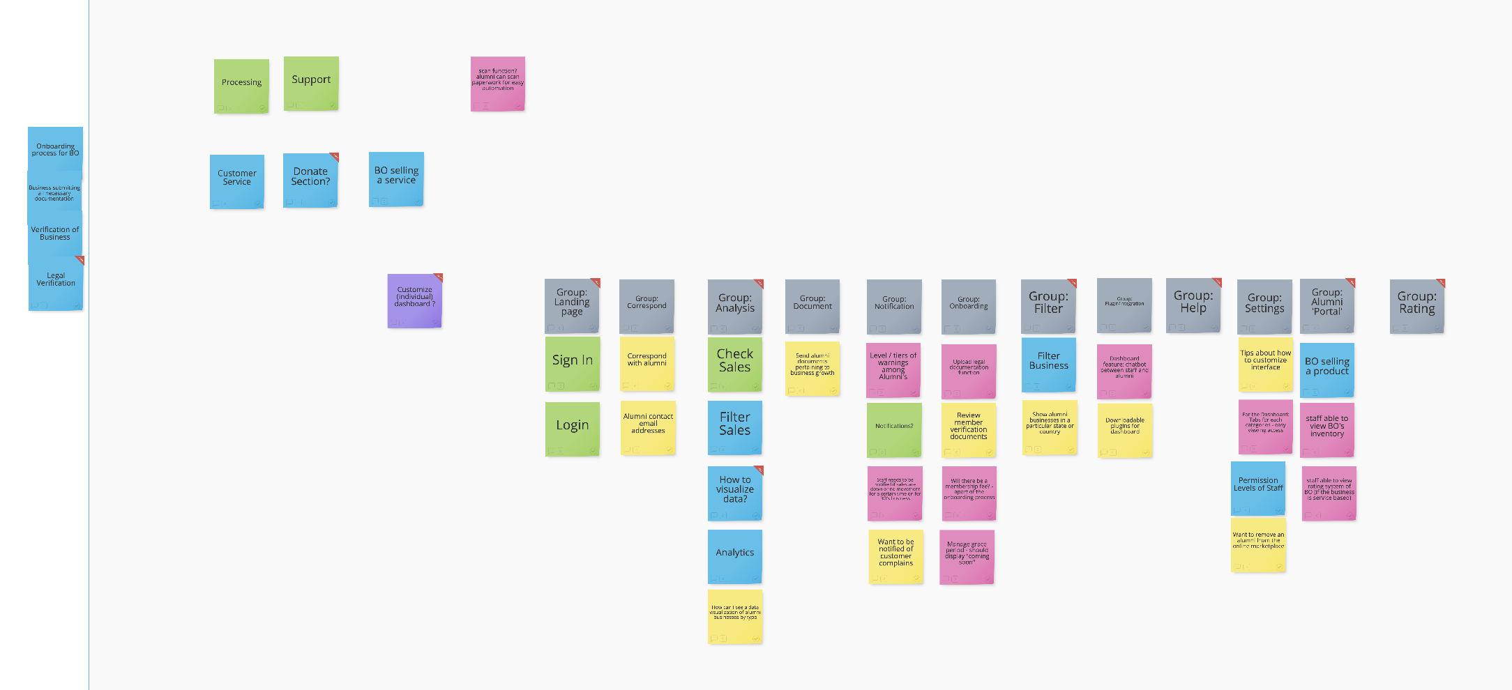
Click to view
We generated the card sorting method to figure out the organizational structure of the dashboard.
We gathered a small group of participants to organize a list of labels we had into categories.
Once the organizational mapping has been established we moved on to….
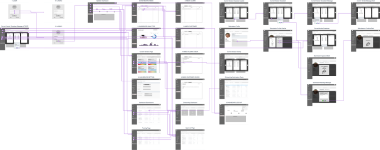
Information Architecture
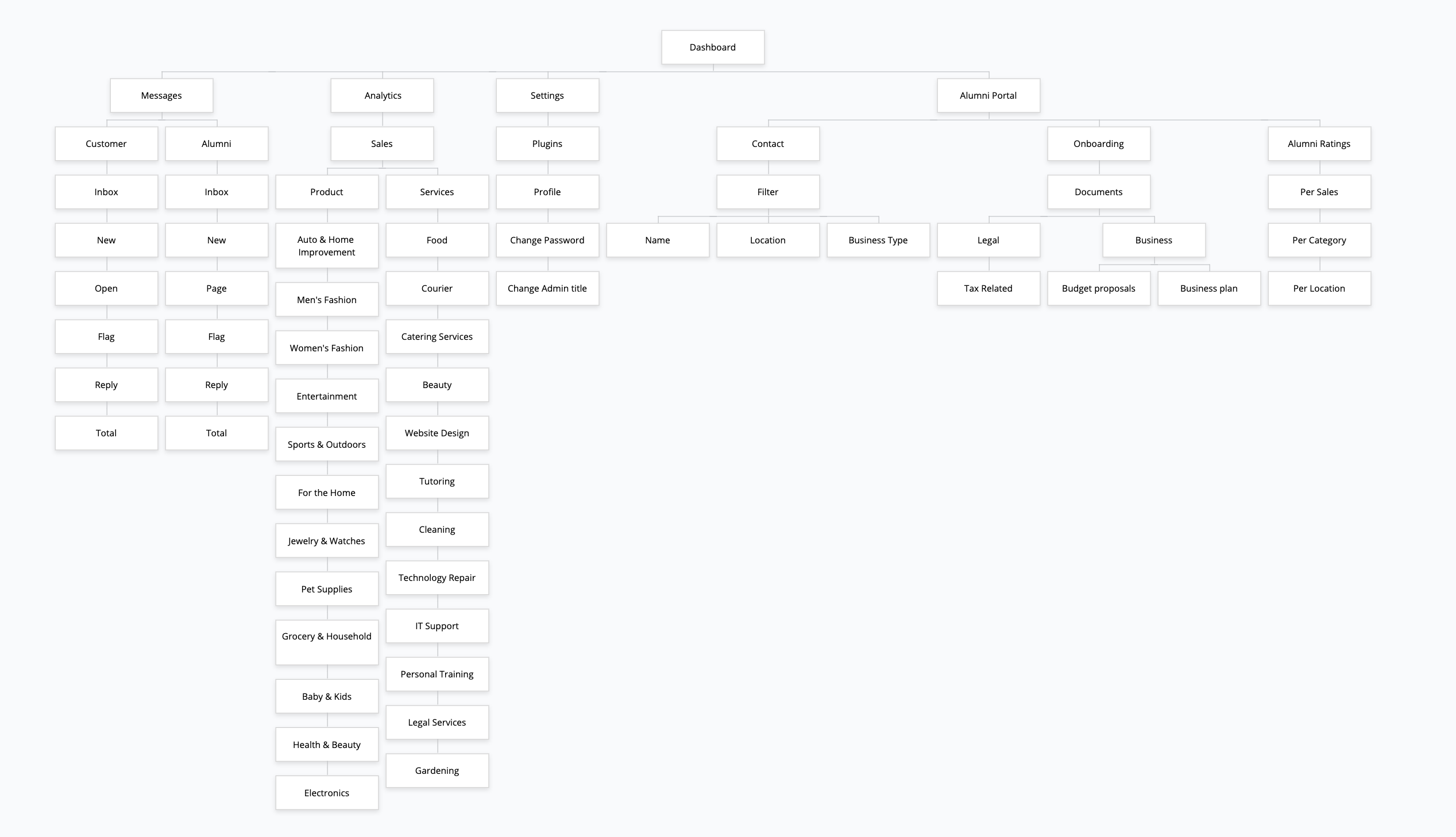
Click to view
After organizing the card sort method, we started structuring the information architect of the site.
User Flow - Application Process
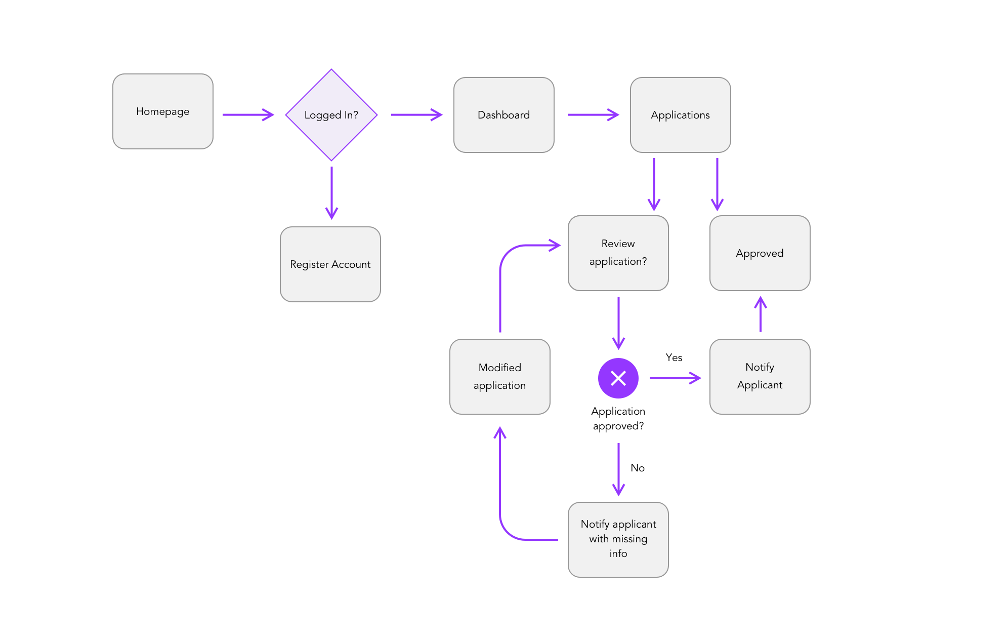
Click to view
One of the features we wanted to focus on was the application process.
I designed the user flow of what the application process would look like.
After planning the structure and flow of the dashboard, we moved forward with the...
Visual Design
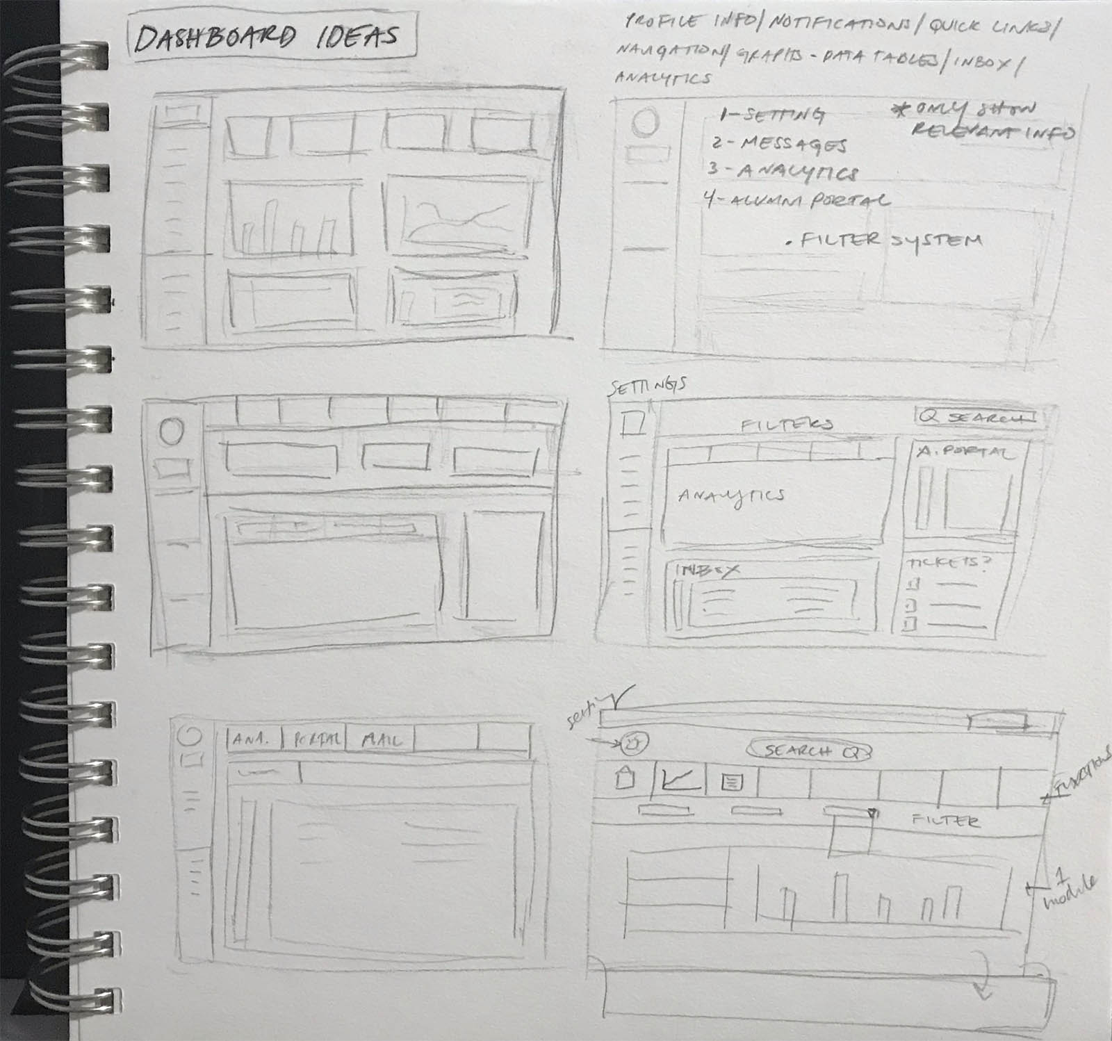
We researched different designs of dashboards for inspiration. As a group, we collectively designed a dashboard and presented them to each other. We initially had the same idea, but took certain elements from each sketch and made it into one.Sketching
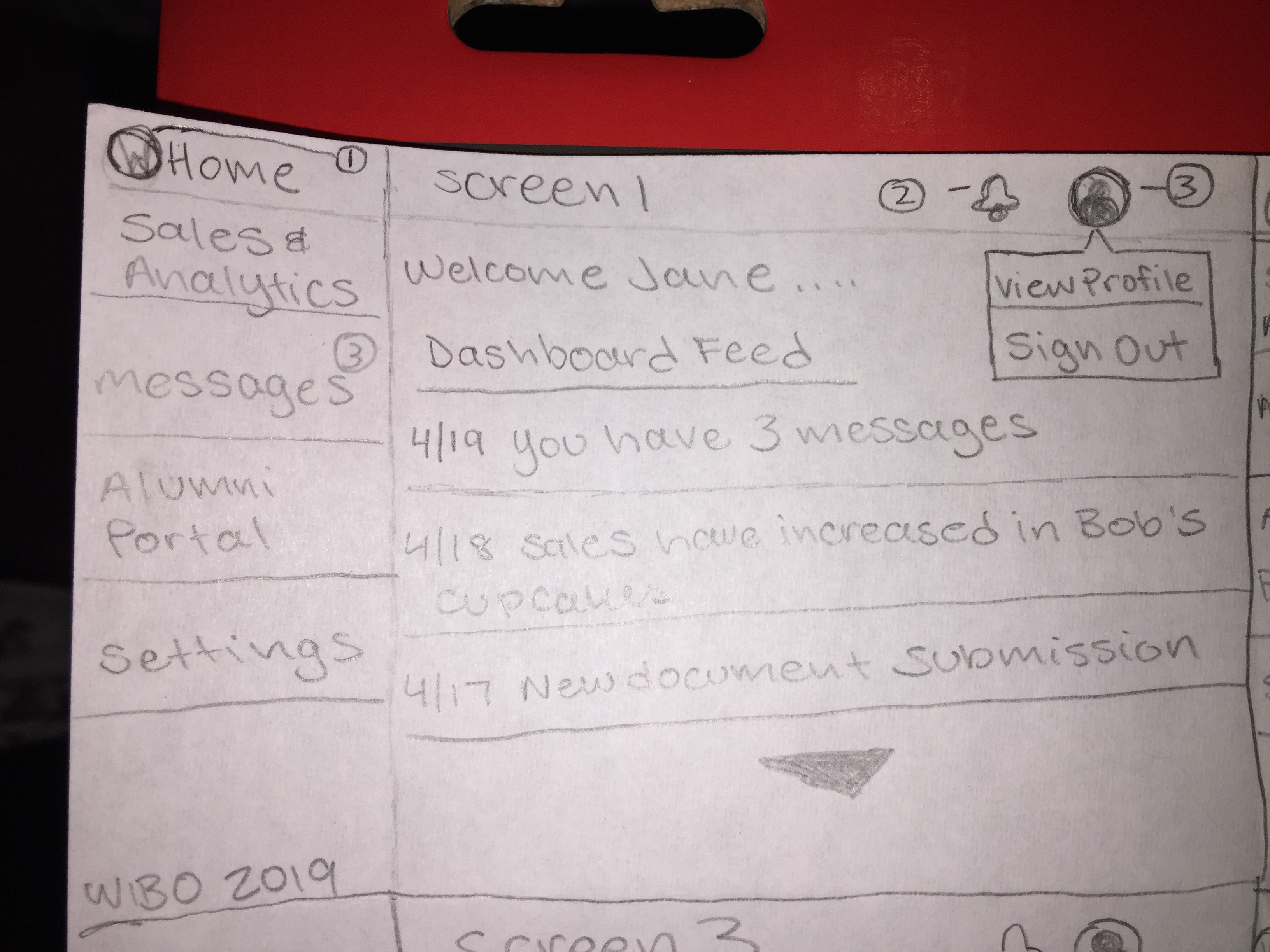
Click to view
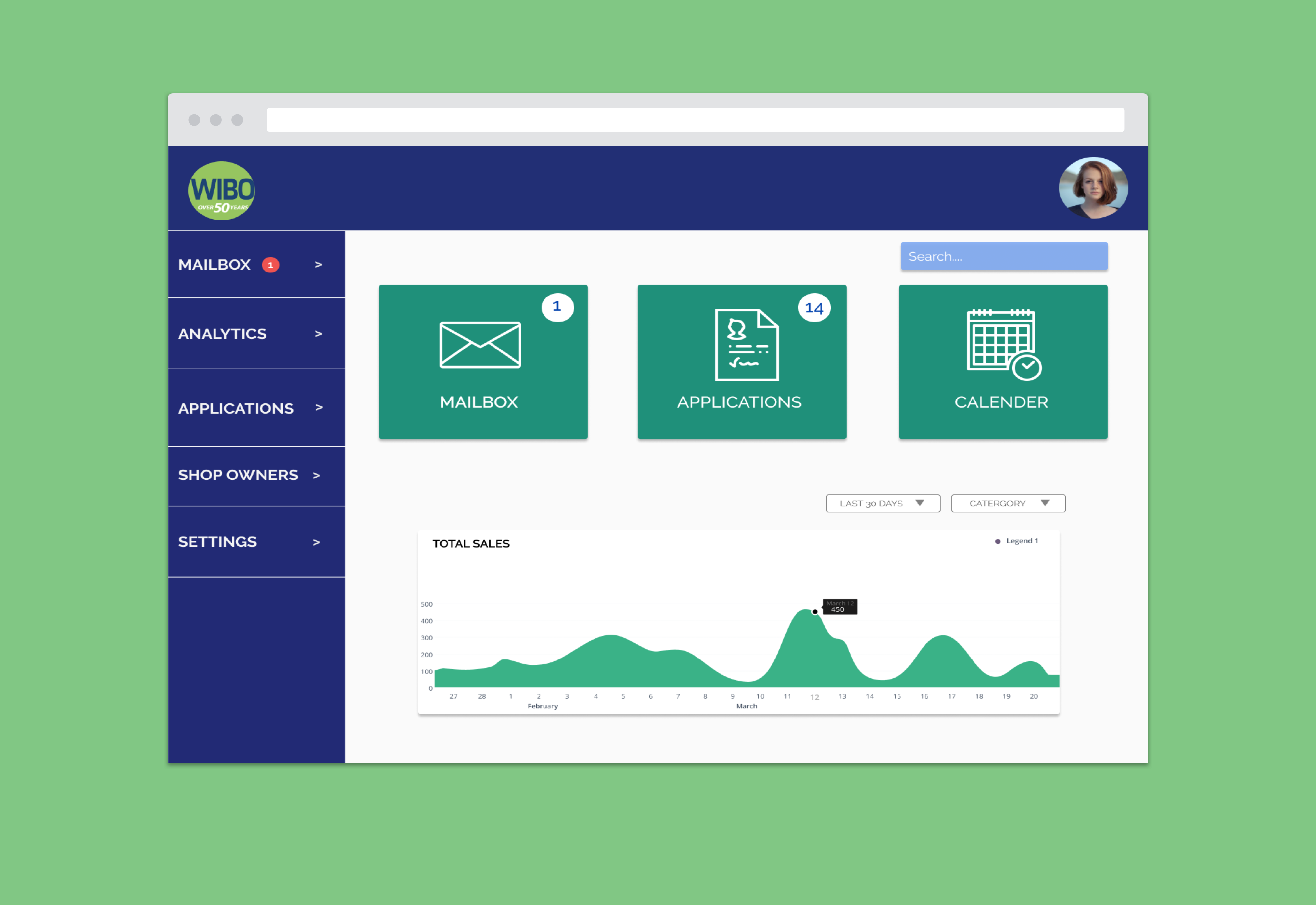
This was my design of the main page of the dashboard after the login process.
Click to view
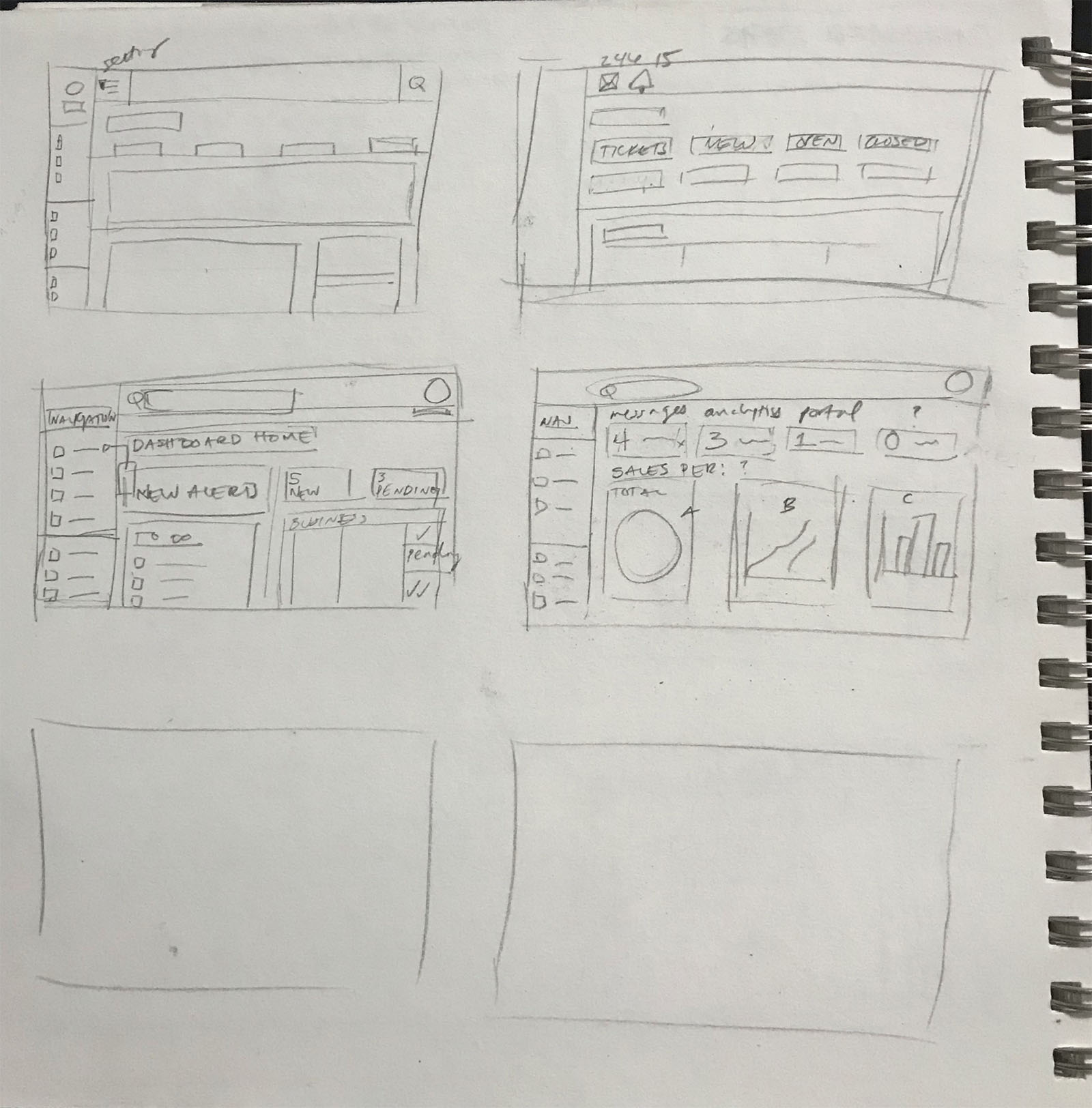
Jalena's design dashboard sketch
Click to view
Jamals's design dashboard sketch
Wireframing
Click to view
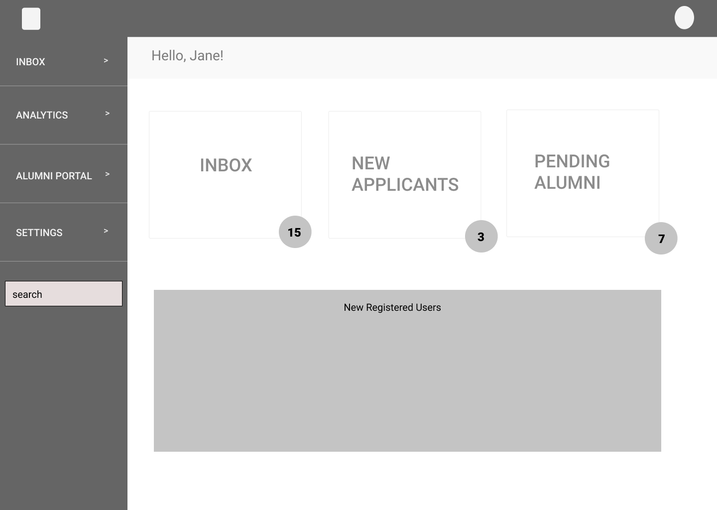
The wireframing of the main page of the dashboard. It would mostly be notifications on what they have in store for the day.
Click to view
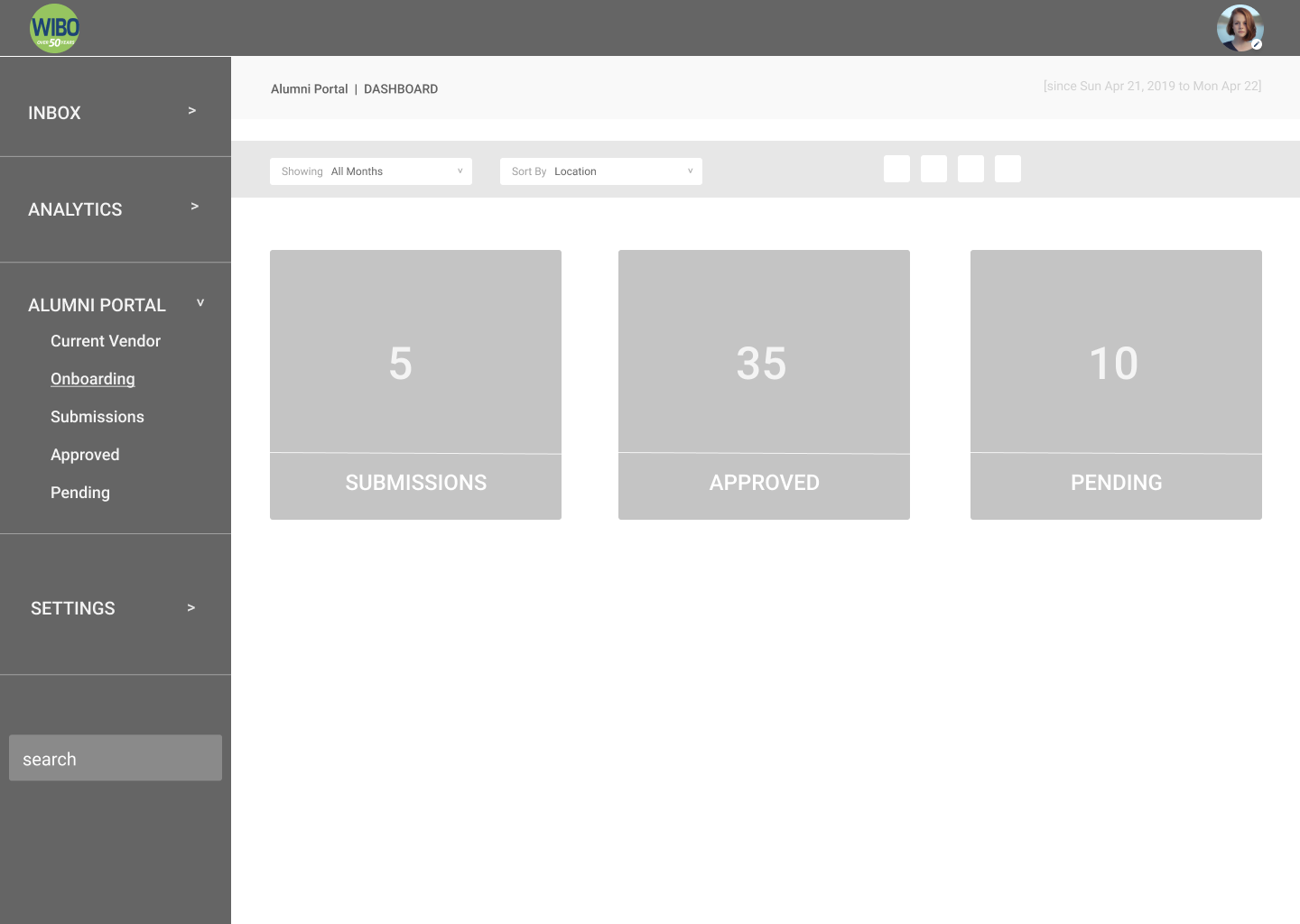
This is the applications page which showcases what phases of the application process goes through.
Medium Fidelity Wireframes - The Mapping
Click to view
User Testing
In our first round of user testings with our medium fidelity prototypes, we had to go through some changes:
Click View
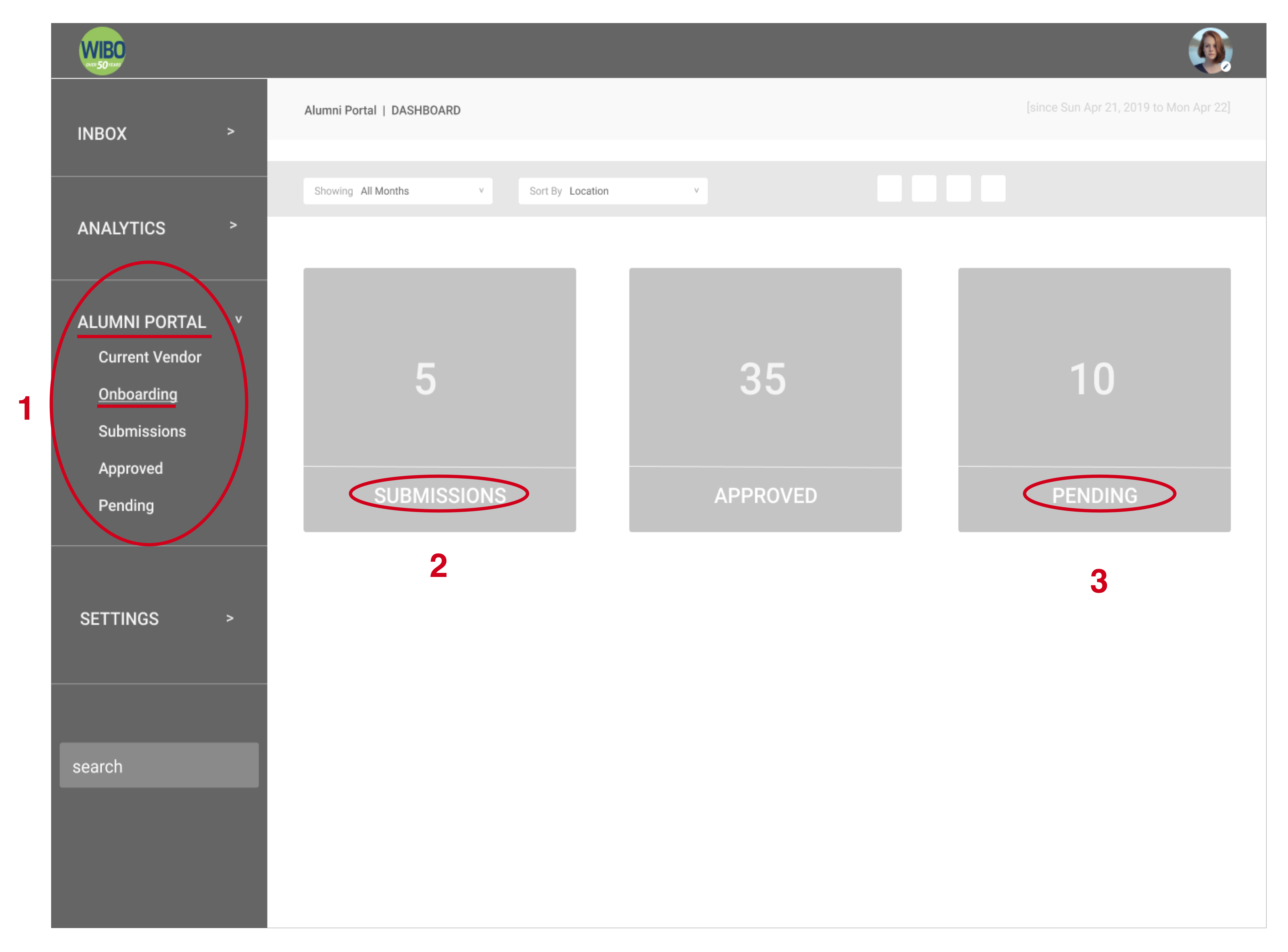
Some of the examples of the labeling and path were confusing in the application process:
- 1. Alumni Portal: A couple of Users were confused that both graduates AND staff members can view the dashboard.
- Onboarding: Originally we had labeled "Onboarding" as the application process. But some Users were confused that the term "Onboarding" is more of training purposes.
- 2. & 3. Users were confused on what the difference between applications that were Submitted vs Pending. One User pointed out: aren't all submitted applications technically pending?
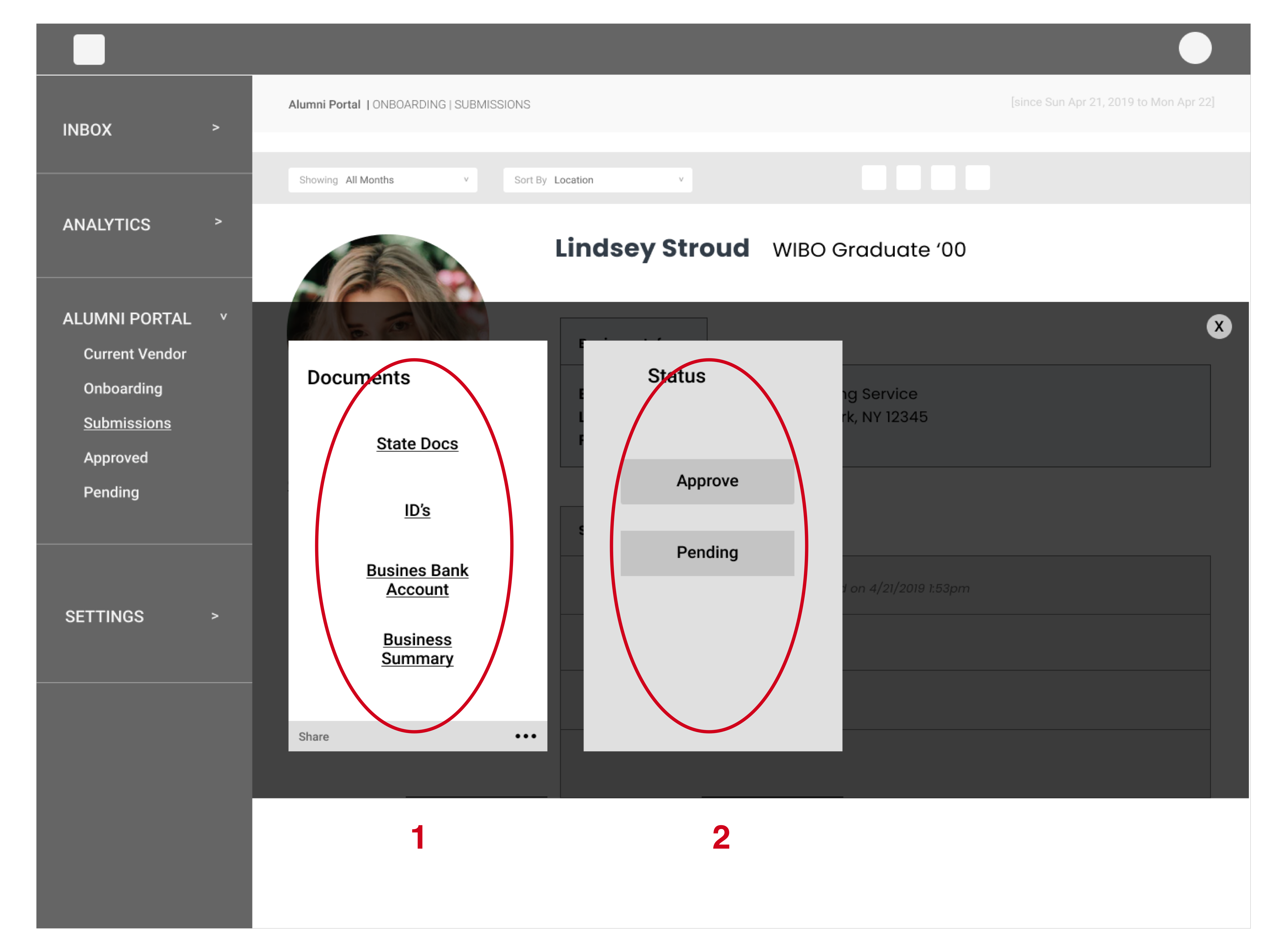
Click View
- 1. There were issues on having the Business Owner's documents and information being displayed and accessiblable like this. All of these documents, might not be necessary.
- 2. Users overlooked STATUS column to APPROVE or PENDING applicants.
After some feedback, we did some necessary changes on the Application design....
Hi-Fidelity Mock Up and User Testing II
We changed the Application process to a more automated system (in the back-end).
Click View
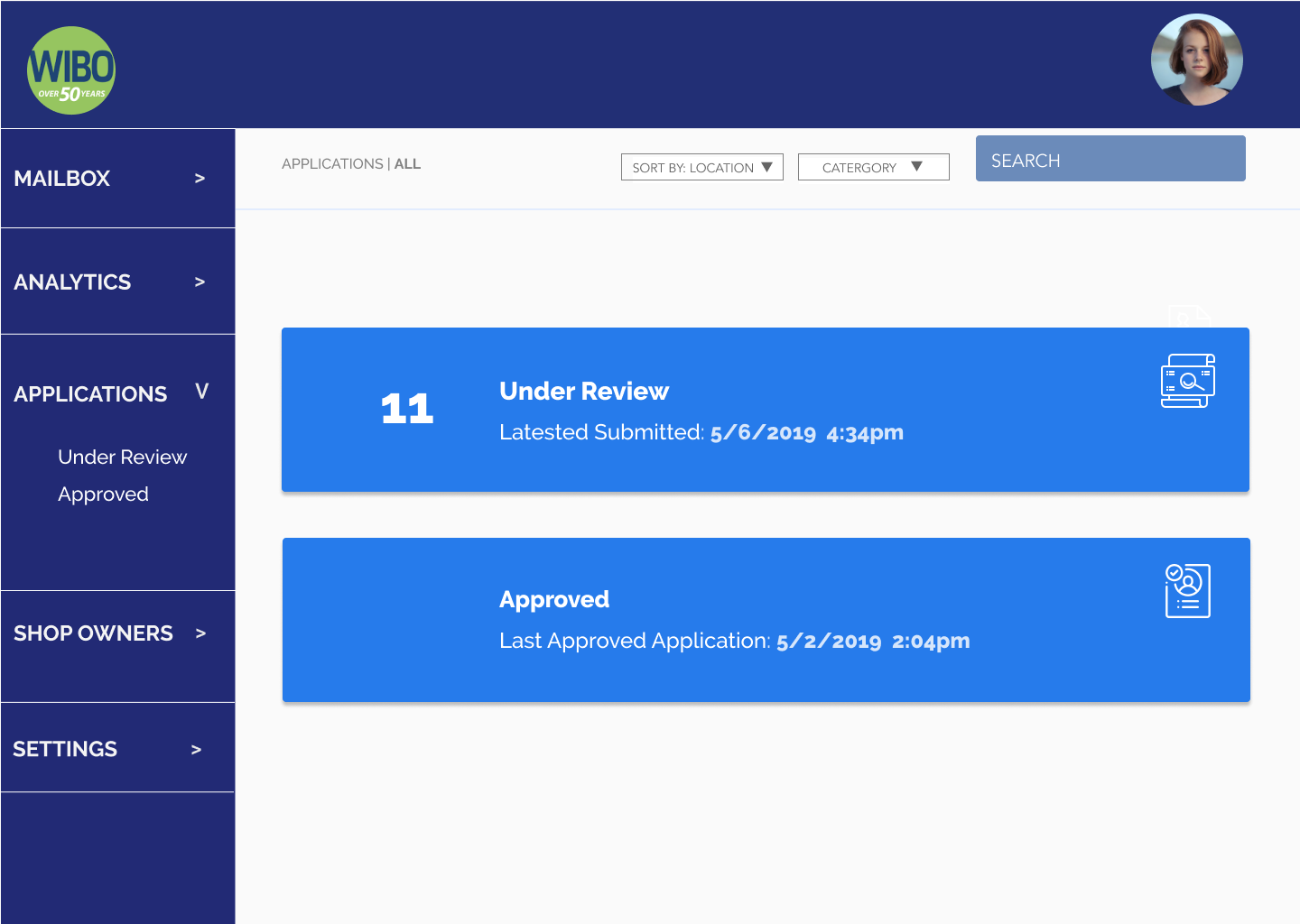
We eliminated 3 categories to 2 - Under Review or Approved. If the Applications are filled out properly and submits all requirements, they will automatically be approved.
If it's Under Review, then the application is missing some information.
Click View
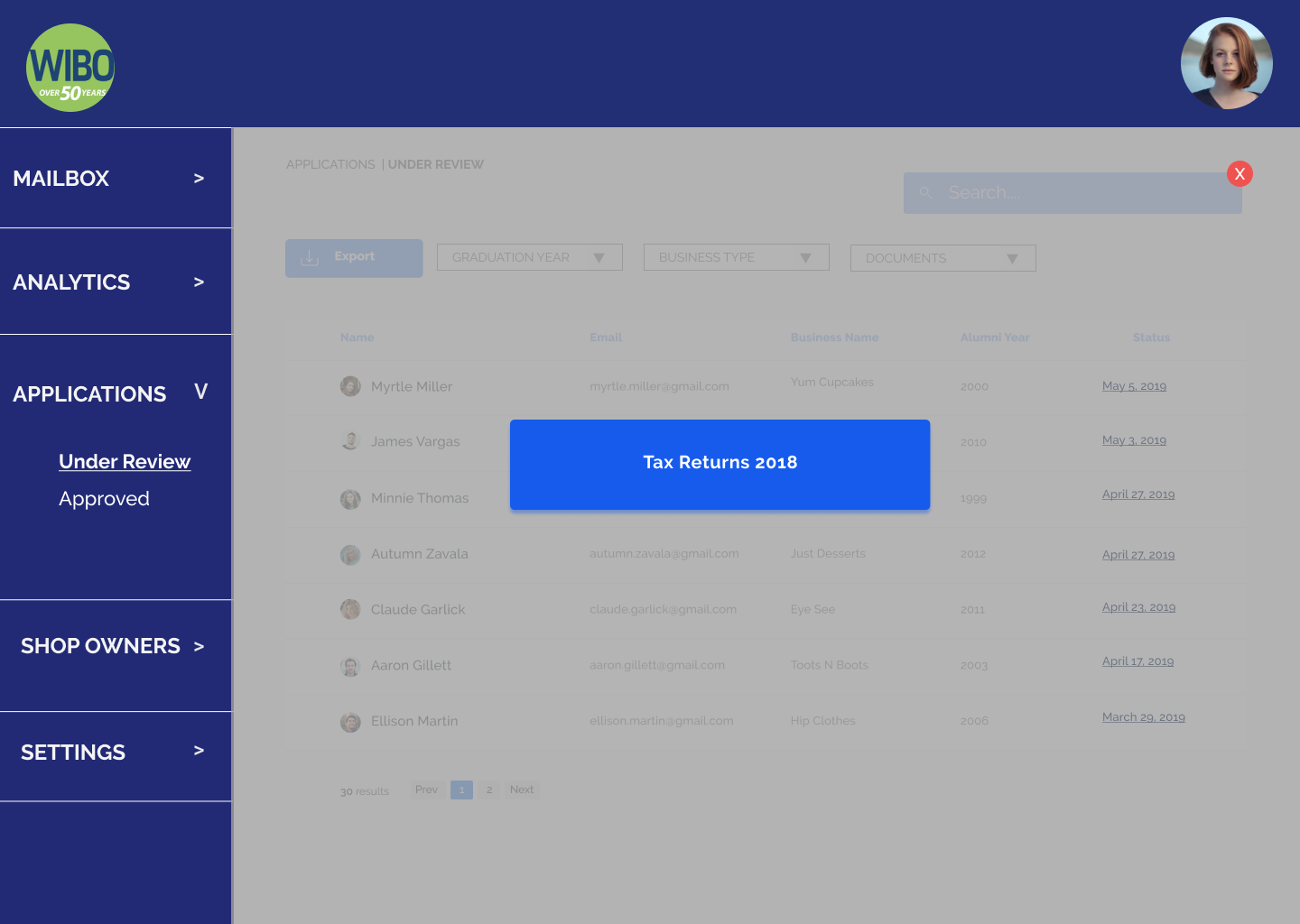
When User clicks on Under Review, there will be a list of applicants that are currently under review.
When User clicks on an applicant, an overlay will appear and list whatever materials they are missing. In this case, it was a copy of their taxes.
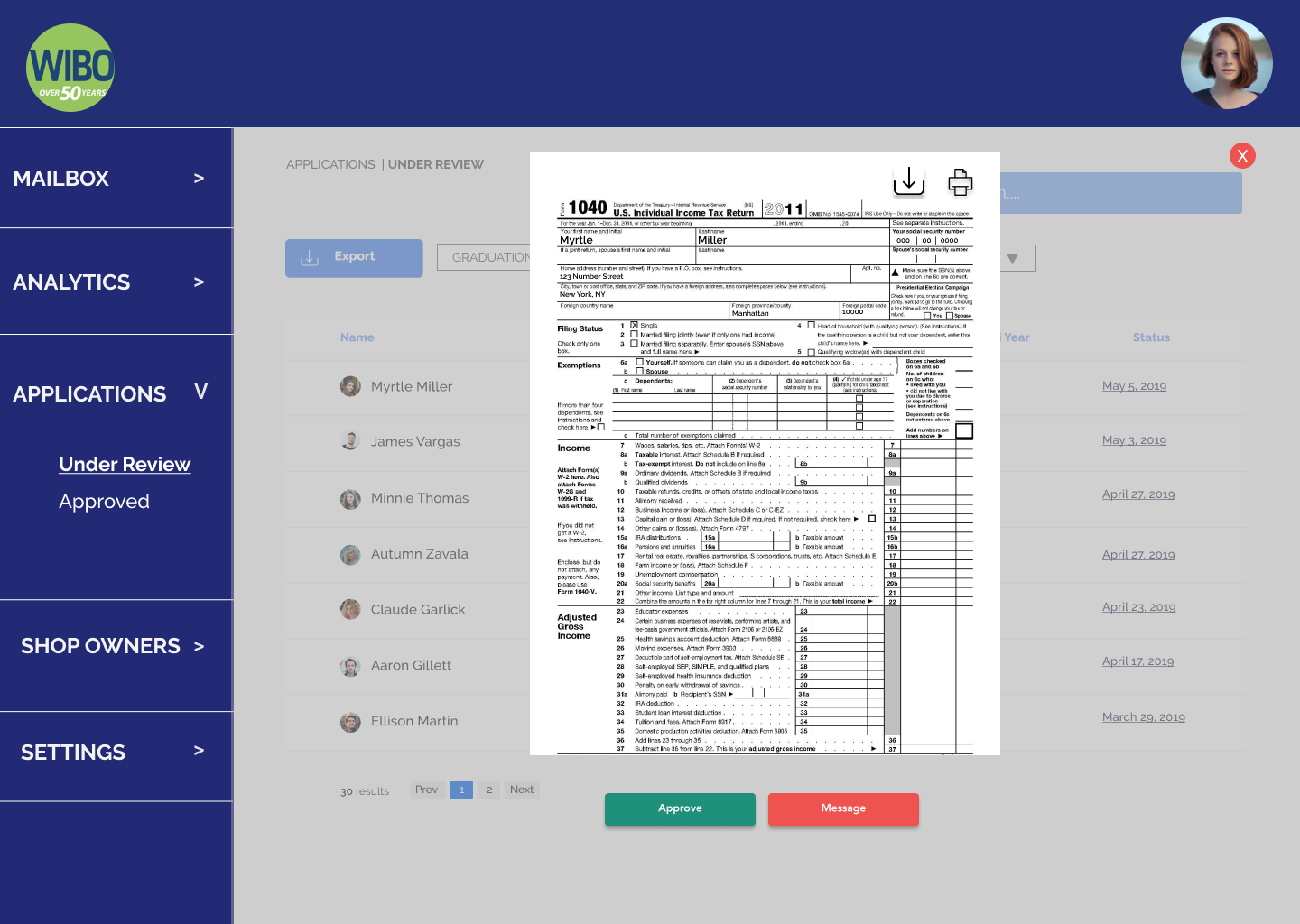
Click View
When User clicks on the updates, they have the choice to approve or send a message if something they need to provide additional resources.
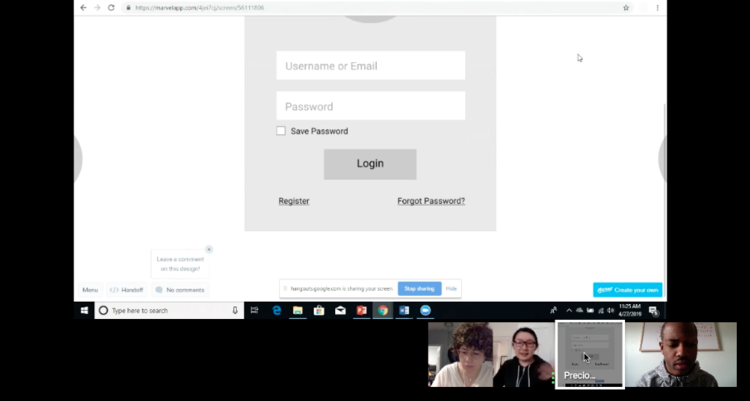
Application Flow - Video
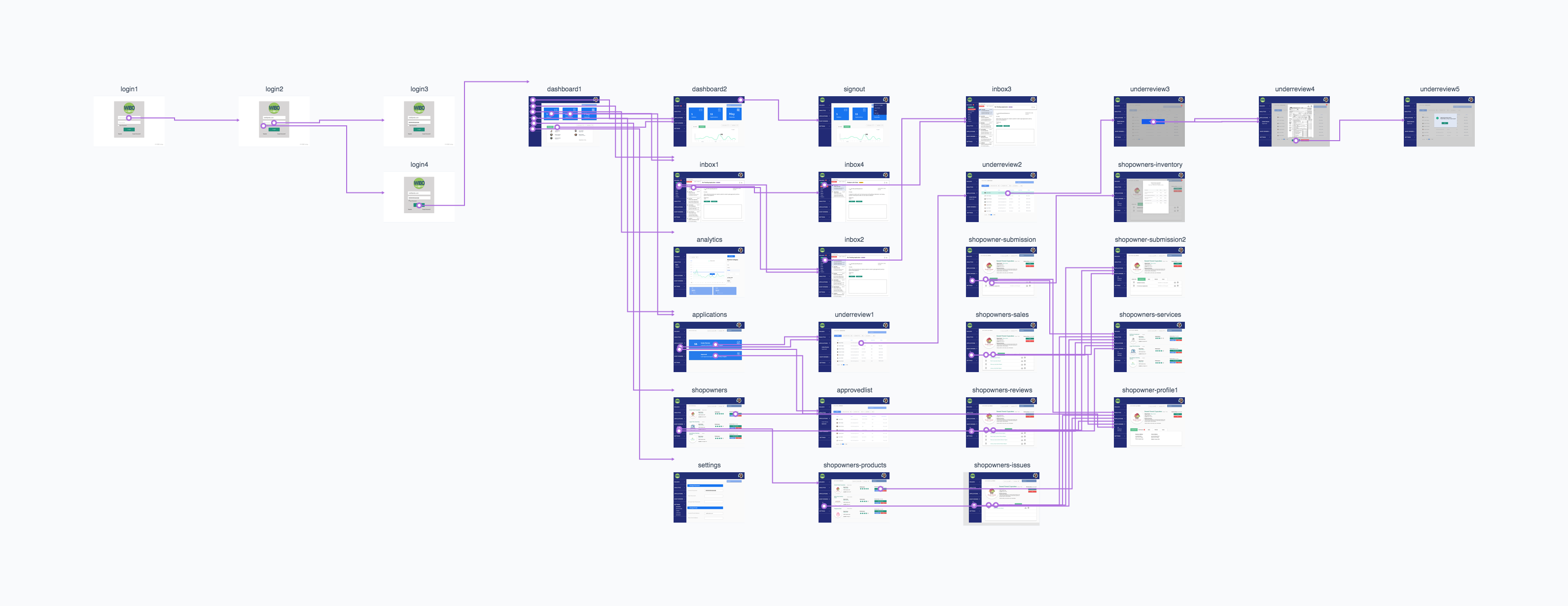
Here is a video of the Application Flow.To view the remaining prototype of the Dashboard, you can view it
Hi-Fidelity Mock Up - The Mapping
We applied the style guide (colors, icons, typography) for our hi-fidelity mock up
USER TESTING
With the changes of the labeling and path, our second round of user testing was much better with less confusion, when it came to the application process. We also fulfilled the requirements of the dashboard that user can view sales and manage the activity among the business owners that participating on the platform.Take Aways and Improvements
I really enjoyed working on this project. The biggest takeaway from this project was learning how to have empathy for your users. We did meet the criterias that the client was looking for, but when we interviewed our users there was an additional features that was missed among the needs of the project (the application process).
Based on some of the feedback from conducting user tests and looking back on my design process these are some of the things I would go back and change/add to a future design iteration:- ShopWIBO Staff Dashboard
- Punch Up
- Ouchie
- Photomatic
- Femme Tech